

If you're on Twitter, you likely saw this viral chart recently. And you probably read a bunch of tweets taking it out of context to make whatever point the poster tends to go on about. I expect that none of these tweets were as informative as this blog post that explains why the data looks the way it does. This is a prime example of why shifting away from tweets and back to blogging could be a very good move!
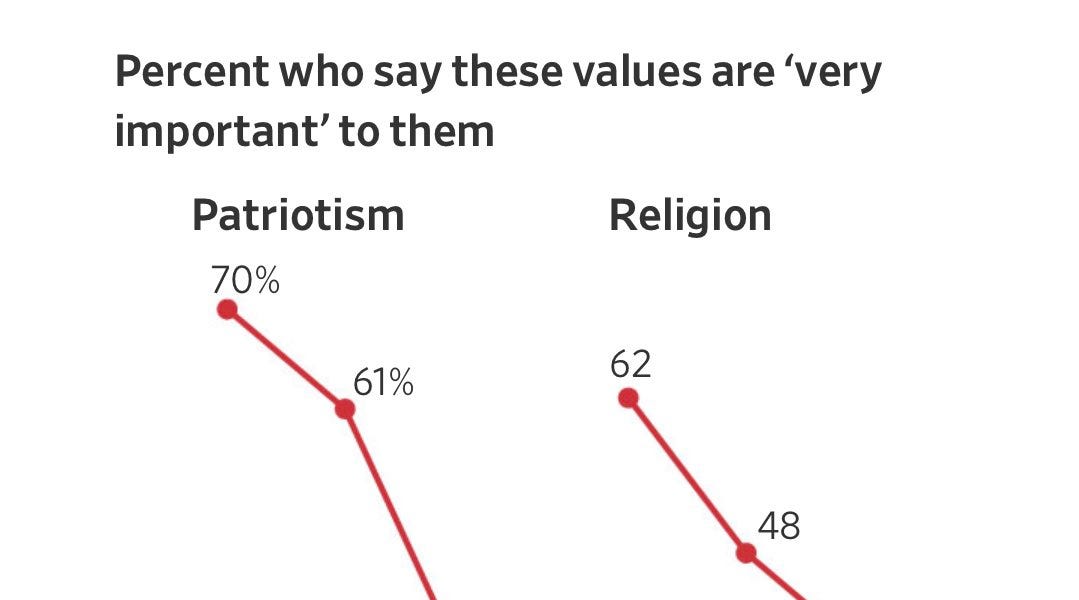
Why this extremely viral poll result might not be real
It's unlikely that Americans are half as patriotic as they were four years ago. Here's what's happening instead.
patrickruffini.substack.com